
Motivation
Responsive designs for traditional styled markup (HTML and CSS) are usually based on device pixel widths. Pixel height breakpoints can be used when necessary but are far less common in most sites and apps. The reason for this is simple: we scroll vertically. The ubiquitous vertical-scroll based design paradigm is implemented using CSS media queries with pixel breakpoints.
So what about 3D-first web tools like three.js and Babylon.js? Many 3D designs are based on scenes created directly in these 3D frameworks, some imported from tools like Blender. And more often than not, the scenes depend on a specific aspect ratio for the canvas in which they are rendered.
Whereas typical 3D applications like games and movies are built for a constant aspect ratio, scaling up and down linearly with canvas size, websites incorporating 3D elements need to adapt to a variety of screen sizes and aspect ratios.
What further complicates things for these projects is that world units in 3D scenes are not equal to the pixel units of the browser viewport. And if they are equal at one plane, they won’t be equal at different distances from the perspective camera.
Increasingly, creative agencies are integrating 3D designs in client work, and these designs need to be responsive.
Responsive Design in Three.js
Note: This post assumes some knowledge of three.js. You should at least be familiar with the concept of cameras and Object3D objects like meshes and groups, as well as materials, lights, and scenes.
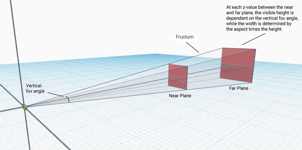
Three.js projects typically use a perspective camera whose frustum – the virtual space in the scene that is visible to the camera – is defined with four parameters: near,far, fov, and aspect.
PerspectiveCamera( fov : Number, aspect : Number, near : Number, far : Number )near: a number that defines the distance in three.js units to a plane in space that is parallel to the camera’s sensor. Anything between this plane and the camera will not be visible.far: a number that defines the distance in three.js units to a plane in space that is parallel to the camera’s sensor. Anything farther than this plane will not be visible.fov: a number that defines a vertical field of view: an angle in degrees that extends from the center of the camera sensor in the vertical direction relative to the camera. Where this angle intersects with thenearandfarplanes, it defines a minimum and maximum height for them. Any object outside of the angle will not be visible.aspect: a number that defines an aspect ratio for the camera. At any distance between the near and far plane, the visible height is determined by thefovangle. The visible width is then determined by the formulawidth = aspect * height.
We can think of the perspective camera as a real-world camera. The area that can be seen by the rectangular sensor and ends up in the photo is dependent on the lens used with the camera.
By setting the four parameters above, we define the frustum’s dimensions. By doing so, we change the properties of the virtual lens that our perspective camera uses. See the figure below.

Pixel units and world units
If the three.js perspective camera is like a real-world camera, then the canvas element comprising the pixels on the client’s screen is analogous to a digital photo sensor comprising a set number of pixels. The sensor of a real-world camera displays everything that is visible to it based on the lens used, just like the canvas displays everything that is visible in the frustum of the perspective camera.
To design a 3D scene responsively requires that objects in the scene be positioned relative to the camera correctly, regardless of the aspect ratio and pixel size of the containing canvas element.
Since we are dealing with a 3D scene, positioning objects on the canvas requires a bit more sophistication than in 2D designs. It becomes more intuitive when thinking about the real-world camera scenario.
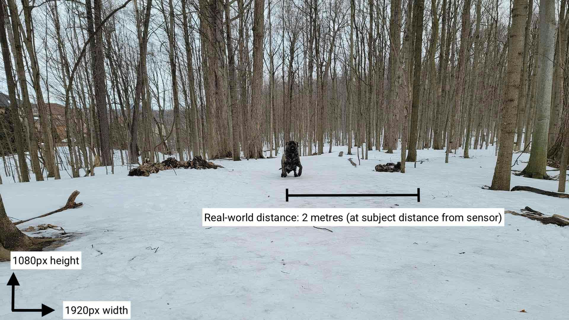
Let’s assume the real-life subject of a photography shoot is standing at the center of the shot. If the camera’s position is fixed and the subject wants to appear at the right end of the photo but at the same distance from the camera(more or less), they will have to walk a certain distance from the center. Let’s say it’s 2 metres.

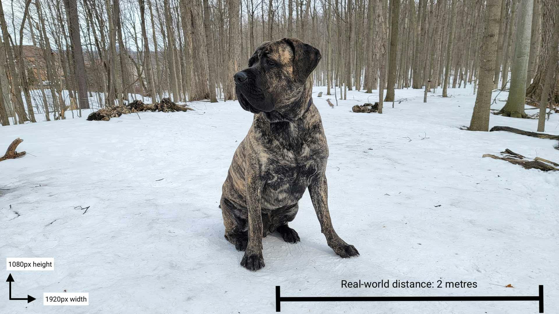
If the real-world camera’s sensor is, say, 1080px by 1920px, then we can convert real-world distance units to the pixel units in the photo itself. Since the person traversed half the photo in two metres, and half the photo is 1920px / 2 = 960px, then the conversion is: 960px = 2 metres or 1 metre = 480px.
There’s no difference between the real-world analogy and three.js. If we know the visible width of the scene in three.js world units, and we know the width of our canvas in pixels, then the conversion is readily obtained.
This type of conversion would be helpful in designing a virtual three.js scene responsively; if we know the conversion from world units to pixel units (both vertical or horizontal), we can figure out things like:
- How wide or high our visible scene is in world units
- Where to place an object in world units so that it fits in the visible part of the scene
- What the maximum distance an object can move is before it is cut out of the scene
Great, right? Well, it gets a bit more complicated than this.
Pixel units and world units: another dimension
Keep everything identical in the real-world scenario, what would happen if the subject continued to stand in the center but moved back, farther away from the camera, instead of moving to the side?
If the person then moved two metres horizontally toward the side, you would find that they are not at the far edge of the picture, as the conversion above would have indicated.
Due to the nature of optics in the real world – or due to the shape of the camera frustum in a three.js scene – the size of the visible plane in (real-) world units changes with the distance to the camera. Even if we set our world units to equal pixel units at a certain distance from the camera, they will be different at another distance, as we’ll see below.

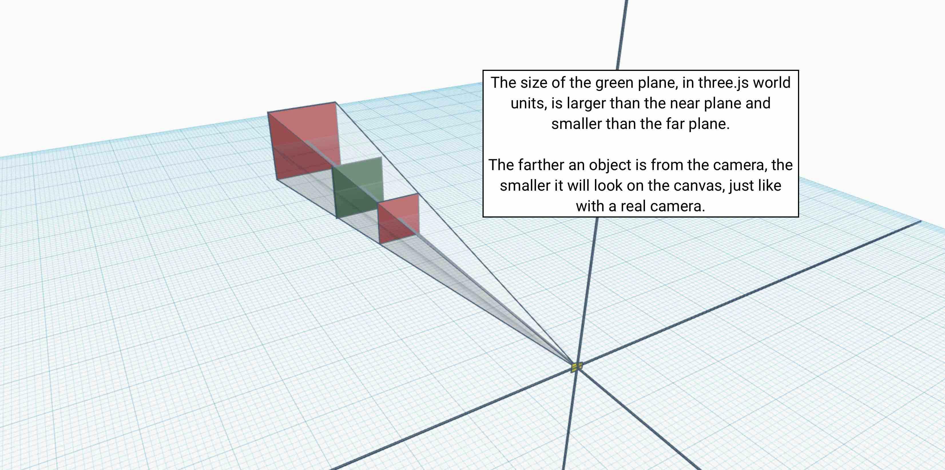
The figure above shows how the visible plane grows with the distance from the camera (i.e., along the camera’s z-axis). The visible plane has a constant aspect ratio at every distance.
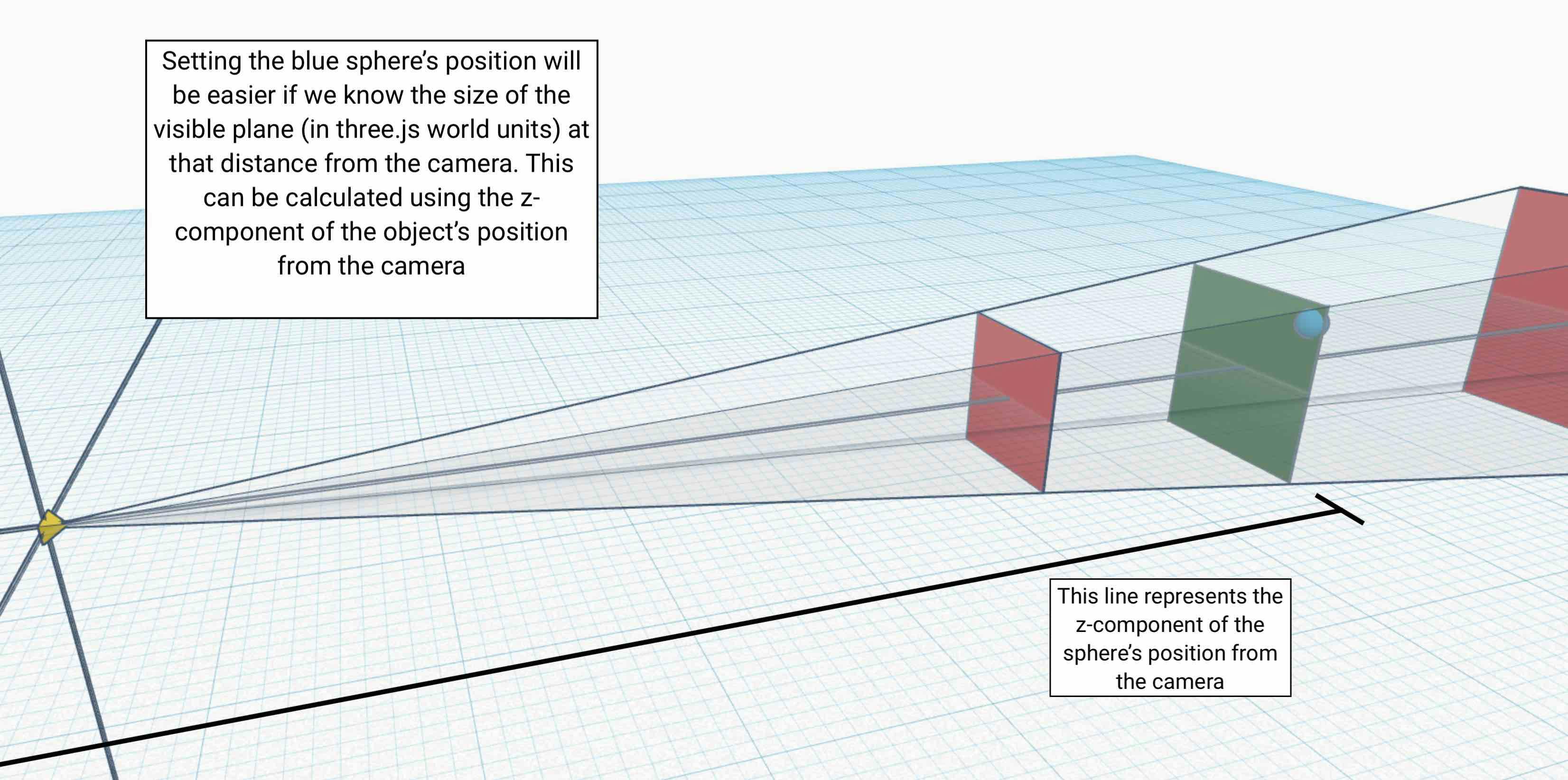
The upshot of this is that when calculating an object's position, you must always take into account the z-component of the object’s position in the coordinate system of the camera.
This is different from the distance from the camera to the object. What we must consider is the distance from the camera’s plane to the plane intersecting with the object’s local origin and parallel with the camera. Every object along this plane can use the same pixel to real-world unit conversion.
Returning to the real-world example from earlier, if we sought to convert between real-world distance and photo sensor pixels for the subject’s new distance from the camera (remember, they moved farther away from the camera at the centre of the photo), we could try a similar procedure as before: have the subject move horizontally from the center of the shot until they are at the right and figure out the distance they walked.
Let’s say it’s now four metres (it was two metres when the subject was closer). Since the person traversed half the photo in 4 metres, and half the photo is1920px/2 = 960px, then the conversion is: 960px = 4 metres or 1 metre = 240px.

Clearly, the farther the object is from the camera, the greater the visible width and height at that distance.
These are useful conversions in 3D responsive design because we need to know how many real-world units an object must move to place it at a pixel-dependent position in the canvas.
If we know the z-component of the object’s position in the camera’s coordinate system – i.e. the one in which the camera is at the point (0, 0, 0) and facing the z-axis – then we can figure out the size (in world units ) of the visible plane at that distance on our own with geometry:
visibleHeight = 2 * Math.tan(fov/2) * objectPositionZThe width can be determined using the aspect:
visibleWidth = aspect * visibleHeight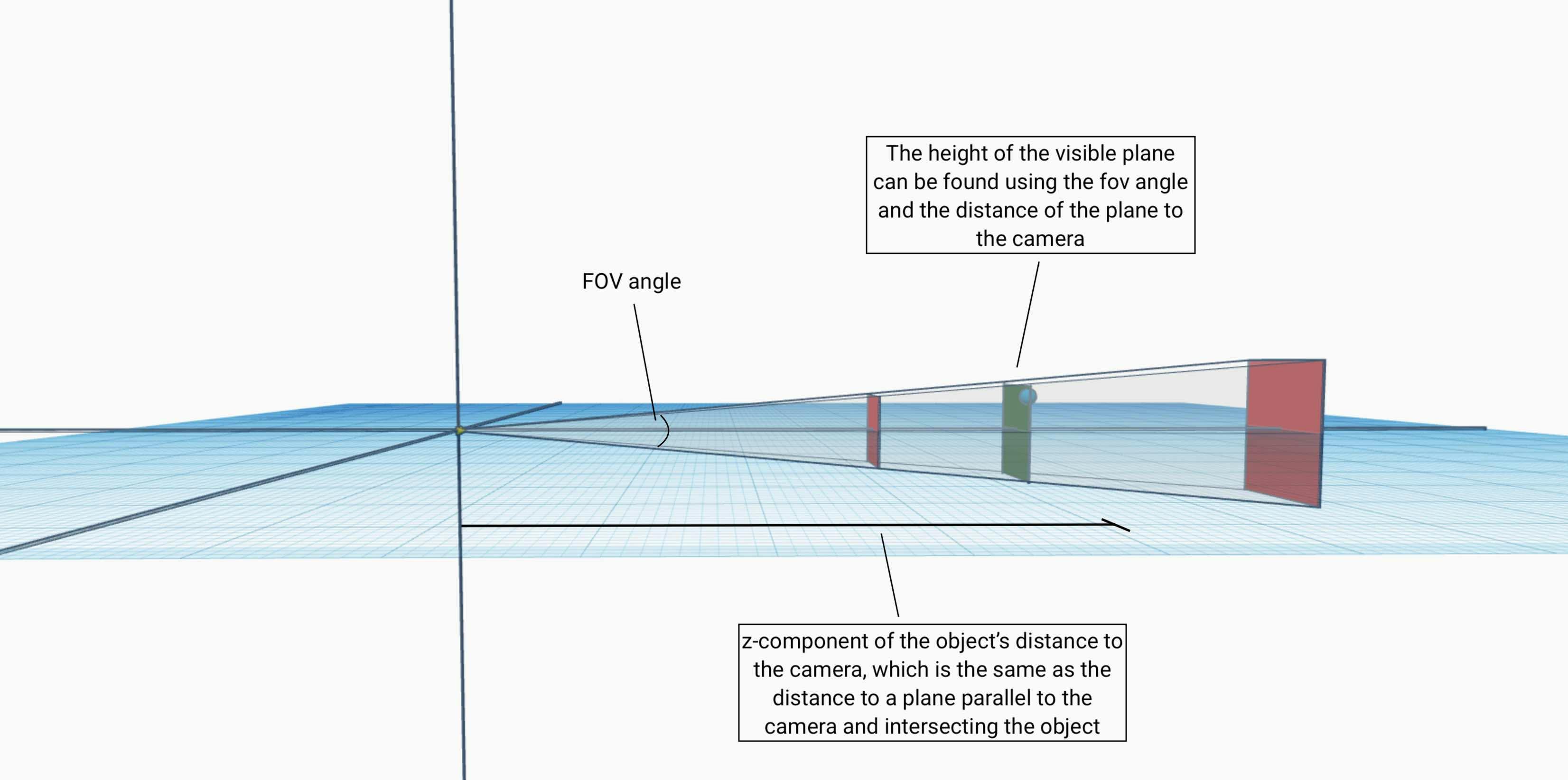
We’re on the right track.
Given the object’s position and the camera’s parameters, we have all the information we need to place it on the canvas at the pixel position we choose. If we wanted to make our scene responsive by moving objects around, we have got a way to make it happen.
For example, if our visible width in world units (wu) is 19200, and our canvas width is 1920px, then our conversion is 19200wu/1920px, or 10 world units per pixel. These calculations can be done dynamically as the canvas size changes to position an object wherever is desired on the canvas.
Incorporating what we know in responsive design
We now have good control over the pixel position where our 3D objects are placed on the 2D canvas. We also have a way to determine how to fit an object in the screen. If we chose to, we could make the scene responsive by only moving objects around. But this isn’t necessarily the best way to adjust a scene to new canvas sizes and aspects. We have a few more general tools at our disposal.
In addition to position changes, we can scale and rotate our objects up and down to better fit the scene. We could also move the camera instead of objects in the scene, though that could become complex quickly and it’s often easier to leave the camera in a fixed position.
One final thing we could do is change thefov. Increasing the fov allows more objects into the scene, while decreasing it has the opposite effect.
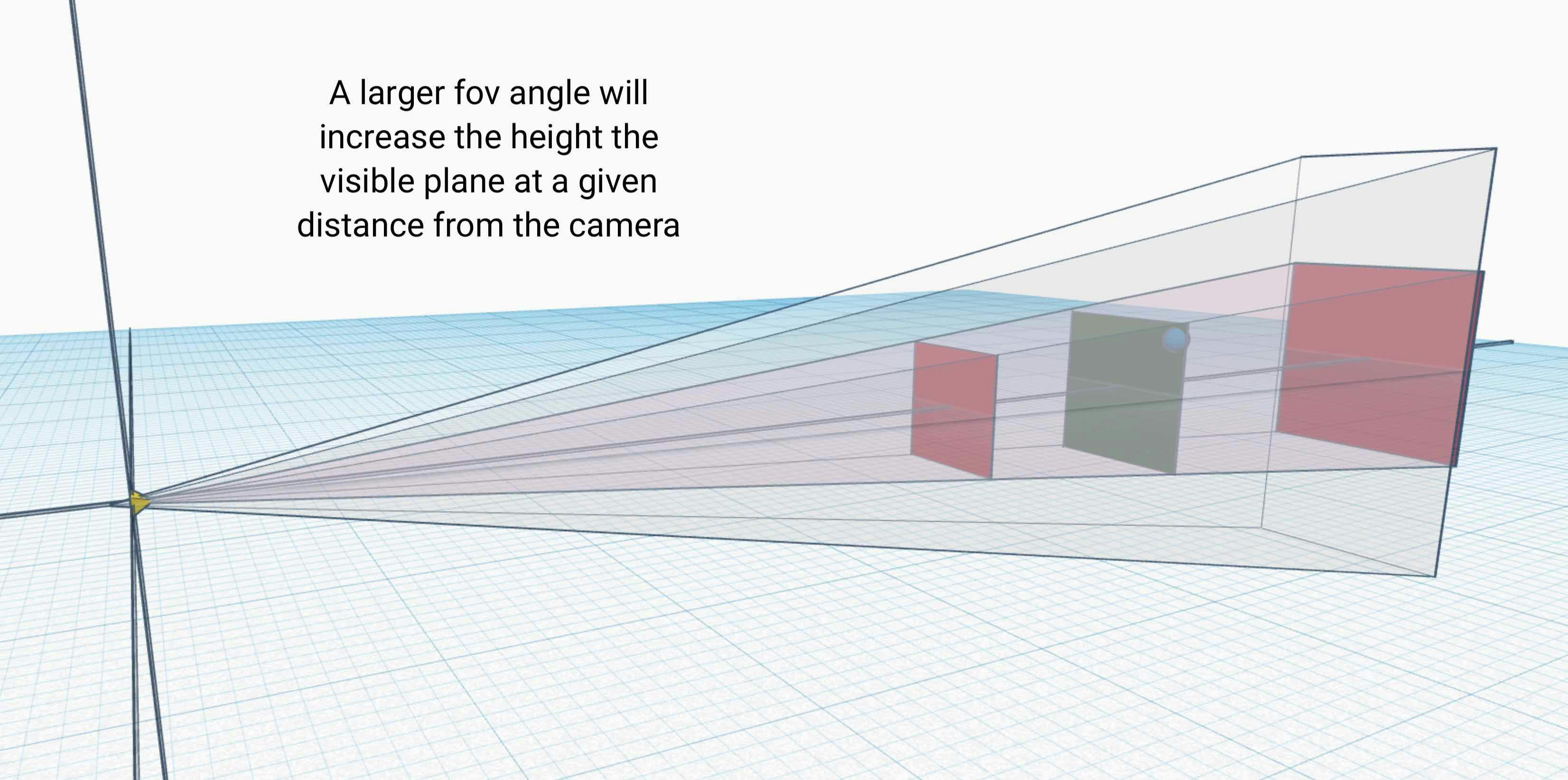
Note: since this is a perspective camera, beware of distortion effects at high fov angles.
From width breakpoints to aspect breakpoints
Now that we have a fairly robust way to change scenes to make them responsive, we should figure out when those changes are necessary. With HTML and CSS we typically use CSS media queries for the viewport pixel width and modify the designs at each breakpoint.
We could try to keep things consistent and modify our scene based on the width of the viewport or the canvas displaying the scene. The problem is that our canvas design isn’t scroll based.
Even if we were to include a large background canvas with elements all over the site, the canvas itself doesn’t scroll. We need to control every aspect of the scene manually.
If we based our responsive 3D design on width breakpoints, we would have trouble when the canvas takes on different heights at that width. At a given width, changing the height of the canvas would scale the scene vertically but either show more of the scene horizontally (if we decreased the height) or show less of the seen horizontally (if we increased the height).
Since the visible height of the canvas in world units is based on the fov angle and the distance from the camera, the canvas will always show the same image on the vertical axis. In other words, the height of the canvas in world units is constant.
If the canvas height is increased but the width remains the same, the scene will be cut off at the edges. If the height is decreased and the width stays the same, the scene will show more of the three.js world horizontally.
Designing with width-based breakpoints is possible but the limitation of this method is that at each width, the scene would have to be designed for multiple heights. That’s a lot of work. Designing with height-based breakpoints would require designing for different widths at each height as well.
Because the fov defines a vertical angle, the vertical axis of the scene will always scale with the canvas height. At any canvas height, the fov must still extend toward the near and far plane and define the scene’s visible height.
Since the height in world units must always be the same, changing the height effectively changes the width of the scene by changing the aspect.
The solution? Responsive 3D design should be done with aspect breakpoints.
If we use aspect breakpoints, we know that since we’ve designed the scene for each aspect, the width and height of the canvas won’t matter. The aspect is unitless and independent of the actual size of the canvas. At different sizes of the same aspect, the scene will simply be scaled up or down.
We can think of designing with aspect breakpoints as keeping the height the same and simply designing the scene for different widths of a given height. This is because the scene scales vertically with increasing canvas height; the visible height is always constant in world units due to the vertical definition of the fov.
Recipes for Responsive Design with three.js and React using useResizeHelper
Here are a few ways to utilize these concepts in responsive 3D designs using three.js. I’ve written a simple React helper hook for those using three.js in that framework.
react-three-fiber is a dependency, so feel free to check it out and use it in your three.js React projects. The helper hook is called react-three-resize-helper.
Recipe 1: determine the visible plane dimensions at your object’s distance
To get the fully visible height and width at the object’s position (i.e., the world-unit height and width of the visible plane parallel to the camera’s x and y axes and perpendicular to the camera’s z axis), use the following formulas:
1height = 2 * Math.tan(fov / 2) * distanceZ;
2width = height * aspect;height: real world height of visible plane atdistanceZ.width: real world width of visible plane atdistanceZ.fov: field of view angle in radians (note: the three.js constructor takes degrees!)distanceZ: the z-component of the distance to the object in the camera’s coordinate system.
If you use react-three-resize-helper, you can simply use
1useResizeHelper(ref, camera);with your object in ref.current and camera a reference to your three.js camera.
The returned object is:
1{
2objMin, //THREE.Vector3: minimum coordinate values that the object occupies in world coordinates
3objMax, //THREE.Vector3: maximum coordinate values that the object occupies in world coordinates
4visWidth, //Number: real world width of visible plane at distanceZ
5visHeight //Number: real world height of visible plane at distanceZ
6};
IMPORTANT: As of v1.0.26, this tool only works if the camera’s z axis is identical to the real world z axis.
It is easiest to have the camera facing the positive z axis at (0, 0, 0), making your coordinate system the same as the world coordinate system. Since useResizeHelper currently enforces that, we can now talk about the two coordinate systems without specifying to which we’re referring.
If you place the camera in this way, you can forego many calculations involving vector projections. If your camera is at (0, 0, 0) facing the positive (0, 0, 0) world axis, you can use visWidth and visHeight to determine what the visible plane is at your object’s position.
Visible plane dimensions: given visWidth, visHeight, the object’sz position component positionZ and a camera placed at the world coordinates, the four corners of the visible plane are at the points:
(-visWidth / 2, -visHeight / 2, positionZ),(visWidth / 2, visHeight / 2, positionZ),
(-visWidth / 2, visHeight / 2, positionZ), and(visWidth / 2, -visHeight / 2, positionZ)
Note that positionZ is equal to distanceZ above since the camera is at (0, 0, 0).
Recipe 2: determine how to place an object where you want it given the visible plane dimensions
By using useResizeHelper in the same way as above, you receive two additional keys in the object: objMin and objMax:
objMinis aTHREE.Vector3vector that contains the minimum position of each component that the object takes in space.objMaxis aTHREE.Vector3vector that contains the maximum position of each component that the object takes in space.
(See THREE.Box3.setFromObject for more info.)
Given our camera placement, we can take objMin.x to be the leftmost position of the object and objMax.x to be the rightmost. Similarly, objMax.y is the position of the highest point of the object and objMin.y is the lowest.
Example 1:
If we wanted to have the object 25% to the left of the canvas and centered vertically, we would change the x position of the object to - visWidth / 4 and the y position to 0.
Example 2:
If we wanted to make sure an object is in screen after a resize, we would make sure that its objMin and objMax x and y values are all within the visible plane delineated by the four corners above.
Recipe 3: use aspect breakpoints instead of pixel width or height breakpoints
useResizeHelper is designed to take care of responsive design for you.
1useResizeHelper(ref, camera, options);parameters:
ref: arefpointing to your objectcamera: your three.js cameraoptions(optional): an object that defines aspect breakpoints and changes to be applied to the scene at each breakpoint
This hook keeps track of the canvas aspect ratio and automatically applies the required changes to your scene when necessary. It’s built to help take care of responsive 3D design through a consistent interface.
If you use react-three-fiber, you can keep with React design principles and have one of these hooks for each component, each hook taking care of an individual object’s responsiveness in the scene.
The hook allows for defining max or min breakpoints. With max breakpoints, the tool checks if the current aspect ratio is below the breakpoint (i.e., the change applies at a maximum aspect ratio of your breakpoint) but not as low as any lower breakpoints. Min breakpoints are the opposite.
Recipe 4: understand what parameters you can change to make your scene responsive
As mentioned above, the scene can adjust to different canvas shape changes by either moving objects, scaling objects, rotating objects, moving the camera, or changing the fov. These cover most of the things you’ll be doing to change your scene.
useResizeHelper takes an optional options argument that allows you to define changes at each breakpoint you define. It includes the options to change positions, rotations, scales, camera positions (only along the z-axis, since it enforces the camera to have the same z-axis as the real world), and fovs, as well as any custom changes with functions that are run with a scope you define.
Conclusion
While 3D responsive design is cursed with the added complication of an extra dimension, the process can be streamlined and broken down in a way that is less cumbersome and more organized. 3D design doesn’t have to be a daunting task if we consider what needs to be done and how it can be done.
After breaking down some of these details, I introduced a few recipes as well as a tool you can use to aid in your development. The documentation for react-three-resize-helper gets into more detail about using the tool so you can start designing responsively in three.js like a pro.